


Tactical Asset Allocation with Macroeconomic Factors
Part 2 - Implementing the Investment Clock with Python

Introduction: Bridging Theory and Practice
Hey there, MacroQuant investors! 👋 Welcome back to our deep dive into tactical asset allocation (TAA).
In Part 1, we explored the theory and frameworks that underpin this powerful investment strategy, focusing on how macroeconomic factors like growth and inflation can guide our decisions. Now, it's time to roll up our sleeves and get into the practical side of things.

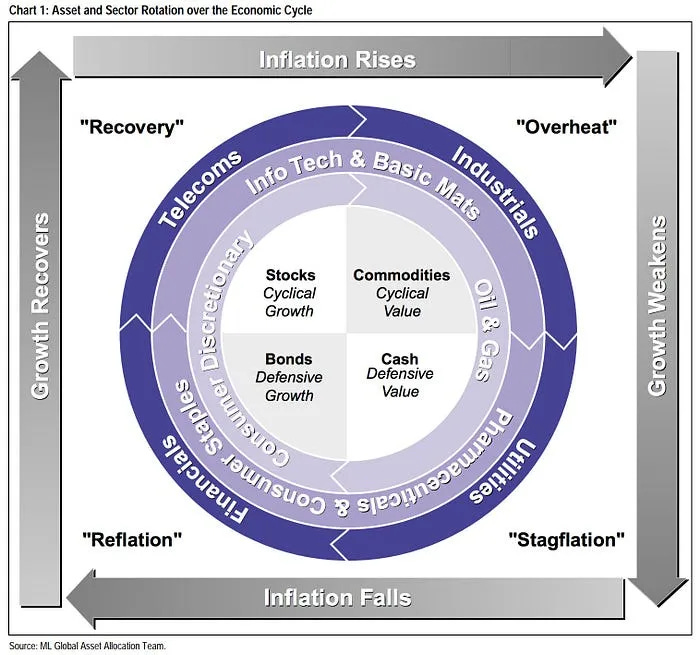
In this article, we're going to walk through the implementation of the Investment Clock model using Python. The Investment Clock, popularized by Merrill Lynch's Global Asset Allocation team, is a dynamic tool that visualizes the economic cycle as a 12-hour clock. This powerful framework integrates key macroeconomic variables—specifically, the output gap and inflation—to help investors anticipate market conditions and make informed tactical decisions.
Why Macro Variables Matter in Market Analysis 🔍
Macroeconomic variables are the vital signs of the economy, directly influencing market behavior – especially for equities and bonds. These variables form the foundation upon which market dynamics are built.
Economic growth, measured by GDP, impacts corporate revenues and earnings, which in turn affect stock valuations. Meanwhile, inflation influences interest rates, directly impacting bond yields and prices.
Chapter 1: Defining Our Key Variables 📊
Before we can build our Investment Clock, we need to get familiar with the two macroeconomic variables that drive it: the output gap and inflation.
1. Output Gap: The Pulse of Economic Activity
To implement our Investment Clock model, we first need to understand and calculate the output gap. The output gap is a crucial economic indicator that measures the difference between actual GDP and potential GDP.
We use the output gap rather than GDP because it provides a relative measure of economic activity, showing us where the economy stands compared to its full potential.
For our analysis, we've downloaded the output gap data directly from FRED (Federal Reserve Economic Data), provided by the St. Louis Fed.
The specific series we're using is calculated as:
This gives us a percentage measure of how far the economy is operating above or below its potential.
Once we have this data, we want to identify periods of economic expansion and contraction. To do this, we'll use Python's SciPy library to find the peaks and troughs in our output gap data. Here's how we can implement this:
from scipy.signal import find_peaks

def find_major_peaks_and_troughs(data, prominence_pct=10, distance=12):
    # Remove NaN values
    clean_data = data.dropna()

    # Calculate the prominence as a percentage of the data range
    data_range = clean_data.max() - clean_data.min()
    prominence = prominence_pct / 100 * data_range

    # Find peaks
    peaks, _ = find_peaks(clean_data, prominence=prominence, distance=distance)

    # Find troughs (by inverting the data)
    troughs, _ = find_peaks(-clean_data, prominence=prominence, distance=distance)

    return clean_data.index[peaks], clean_data.index[troughs]

# Find major peaks and troughs for Output Gap data
output_gap_peaks, output_gap_troughs = find_major_peaks_and_troughs(output_gap_data, prominence_pct=20, distance=24)
This function uses SciPy's find_peaks to identify significant peaks and troughs in our output gap data. We set a prominence percentage to ensure we're catching major turns in the economic cycle, and a minimum distance between peaks to avoid picking up on minor fluctuations.

By identifying these peaks and troughs, we can determine when the economy is expanding (moving from a trough to a peak) or contracting (moving from a peak to a trough). This information is crucial for our Investment Clock model, as different assets tend to perform better during different phases of the economic cycle.
2. Inflation: Tracking Price Dynamics
The second key variable in our Investment Clock model is inflation. We'll focus on the Consumer Price Index (CPI) year-over-year change, as this is the metric targeted by the Federal Reserve in its monetary policy decisions. The investment clock is designed to incorporate policy changes, making this measure particularly relevant.
The year-over-year percentage change in the Consumer Price Index (CPI) is a common way to track inflation. In Python, this can be done using the formula:
Here's how we processed the data:
# Calculate year-over-year CPI change
cpi_df['CPI_YoY'] = cpi_df['CPI'].pct_change(periods=12) * 100

# Find major peaks and troughs for CPI data
cpi_peaks, cpi_troughs = find_major_peaks_and_troughs(cpi_df['CPI_YoY'], prominence_pct=10, distance=12)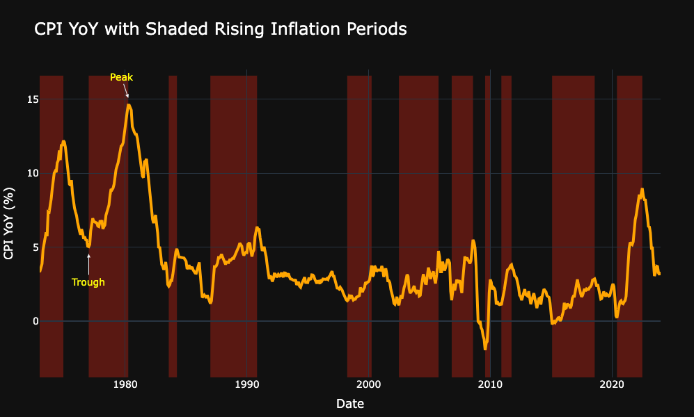
By calculating these two variables, we can start to understand where we are in the economic cycle.

Chapter 2: Combining Variables to Create Regimes 🔄
Now that we have our key variables - the output gap and inflation - the next step is to combine them to define economic regimes. These regimes are the building blocks of the Investment Clock and will guide our tactical asset allocation decisions.
Creating the Regimes
We'll classify the economy into four distinct regimes based on the relationship between the output gap and inflation. Our approach involves identifying periods of high and low growth and inflation based on the peaks and troughs we found earlier.
Here's how we implement this in Python:
def classify_trend(date, peaks, troughs):
    """Classify if we're in a high or low period based on peaks and troughs"""
    turning_points = sorted(list(peaks) + list(troughs))

    if date <= turning_points[0]:
        return 'low' if turning_points[0] in peaks else 'high'

    for i in range(len(turning_points) - 1):
        if turning_points[i] <= date < turning_points[i+1]:
            return 'high' if turning_points[i] in troughs else 'low'

    return 'high' if turning_points[-1] in troughs else 'low'

# Create a date range covering both series
start_date = min(cpi_data.index.min(), output_gap_data.index.min())
end_date = max(cpi_data.index.max(), output_gap_data.index.max())
date_range = pd.date_range(start=start_date, end=end_date, freq='ME')

# Create the dataframe
df = pd.DataFrame(index=date_range)

# Classify growth and inflation for each date
df['growth'] = df.index.map(lambda date: classify_trend(date, output_gap_peaks, output_gap_troughs))
df['inflation'] = df.index.map(lambda date: classify_trend(date, cpi_peaks, cpi_troughs))

# Define the regime mapping
regime_map = {
    ('low', 'low'): 'Reflation',
    ('high', 'low'): 'Recovery',
    ('high', 'high'): 'Overheat',
    ('low', 'high'): 'Stagflation'
}

# Assign regimes
df['regime'] = df.apply(lambda row: regime_map[(row['growth'], row['inflation'])], axis=1)
Let's break down this approach:
We define a classify_trend function that determines whether we're in a high or low period for a given variable (output gap or inflation) based on its peaks and troughs.
We create a date range that covers our entire dataset.
For each date, we classify the growth (output gap) and inflation as either 'high' or 'low'.
We define a regime mapping that combines the growth and inflation states into four distinct regimes:
Recovery (High Growth, Low Inflation): This phase is characterized by strong economic growth with minimal inflationary pressure.
Overheat (High Growth, High Inflation): In this phase, the economy is growing rapidly, and inflation is picking up.
Stagflation (Low Growth, High Inflation): This is a challenging environment where economic growth is weak, but inflation remains high.
Reflation (Low Growth, Low Inflation): In this phase, both growth and inflation are subdued.

This approach allows us to create a time series of economic regimes, providing a clear picture of how the economy has moved through different phases over time.

Chapter 3: Measuring Returns in Each Regime 💰
With our economic regimes defined, the next crucial step is to analyze how different asset classes perform in each environment. This analysis serves two primary purposes: it helps validate our Investment Clock model and provides valuable insights for refining our tactical asset allocation strategy.
Methodology
To conduct this analysis, we'll calculate the average annual real returns for major asset classes within each regime. We'll be using real returns (returns adjusted for inflation) in our analysis, as we are comparing performance across different inflationary environments.
Here's the Python code we use to calculate and visualize these returns:
import plotly.graph_objects as go

def plot_regime_returns(data, assets=['stocks', 'bonds']):
    # Function to calculate annualized return
    def annualize(returns):
        return (1 + returns.mean()) ** 12 - 1

    # Calculate annualized real returns for each regime
    regime_returns = data.groupby('regime').agg({f'{asset}_r': annualize for asset in assets})
    regime_returns.columns = assets  # Simplify column names
    regime_returns = regime_returns.reset_index()

    # Plot the data
    fig = go.Figure()
    for asset in assets:
        fig.add_trace(
            go.Bar(
                x=regime_returns['regime'],
                y=regime_returns[asset],
                name=asset.capitalize(),
                text=regime_returns[asset].apply(lambda x: f'{x:.1%}'),  # Format as percentage
                textposition='auto'
            )
        )

    # Basic layout settings
    fig.update_layout(
        title="Average Annual Real Returns by Regime",
        xaxis_title="Regime",
        yaxis_title="Average Annual Real Return",
        barmode='group'
    )

    # Show the plot
    fig.show()

# Example usage:
# Assuming 'data' is your DataFrame with columns 'regime', 'stocks_r', 'bonds_r', etc.
# plot_regime_returns(data, assets=['stocks', 'bonds'])
This code calculates the annualized real returns for each asset class within each regime and creates a bar chart to visualize the results.
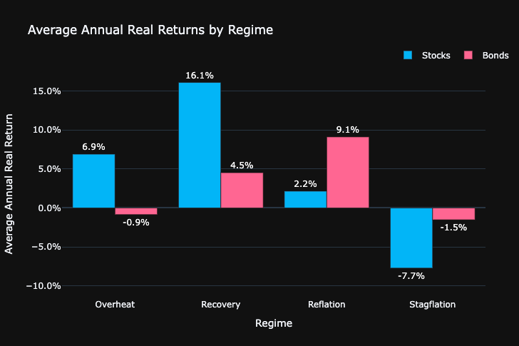
Results and Analysis
Let's examine the average annual real returns for stocks and bonds across the four regimes:
Recovery (High Growth, Low Inflation):
Stocks: 16.1%
Bonds: 4.5%
In this phase, stocks significantly outperform bonds. This aligns with economic theory, as companies benefit from strong growth and low inflation, leading to higher profits and stock prices.
Overheat (High Growth, High Inflation):
Stocks: 6.9%
Bonds: -0.9%
Both assets show lower returns compared to the Recovery phase. Stocks still perform positively, likely due to strong nominal growth, while bonds suffer due to rising inflation.
Stagflation (Low Growth, High Inflation):
Stocks: -7.7%
Bonds: -1.5%
This is the most challenging environment for both stocks and bonds. High inflation erodes returns, while low growth impacts corporate profits.
Reflation (Low Growth, Low Inflation):
Stocks: 2.2%
Bonds: 9.1%
In this phase, bonds outperform stocks. Low inflation benefits bond returns, while low growth hampers stock performance.
These results largely confirm the intuition behind the Investment Clock model. They also align closely with the findings from the Merrill Lynch report, which shows similar patterns of asset performance across regimes.
Chapter 4: Using the Investment Clock and Conclusion 🕰️
Now that we've done the heavy lifting, it's time to bring it all together and apply the Investment Clock model in a real-world context. But first, an important clarification:
What this Model Shows
This Investment Clock model is not a real-time, quantitative trading rule. Rather, it's a framework that suggests how a correct macro view could pay off in a particular way. It's a powerful justification for economics teams and macro strategies in asset management.
Applying the Investment Clock
The Investment Clock visualizes the economy as a clock face, with each quadrant representing one of the regimes we've defined. By tracking current economic data, we can position our portfolios to potentially benefit from the expected phase of the cycle.
In practice, this means:
Identifying the Current Phase: We need to develop a systematic way of determining where we are in the cycle. This involves looking at recent economic data. For example:
Use a proxy for real GDP growth, such as the ISM survey.
Look at the CPI to gauge inflation relative to a moving average.
Combine these to decide if we're in Recovery, Overheat, Stagflation, or Reflation.
Forecasting the Next Phase: Economists are generally concerned with forecasting the future level of a range of economic indicators. For our purposes, we're more interested in the future direction of the output gap and inflation.
Adjusting Your Portfolio: Based on the current regime and our forecast, we can tilt the portfolio towards asset classes that historically performed well in that environment.
Conclusion: A Framework for Tactical Decisions
The Investment Clock is a powerful tool for making informed tactical asset allocation decisions. By combining the output gap and inflation to define economic regimes, we can anticipate potential market shifts and position our portfolio accordingly.
Remember, this model provides a framework, not a crystal ball. It should complement, not replace, fundamental analysis and risk management practices.
The key to successful tactical asset allocation is not just understanding the theory but also being able to implement it effectively. With the Python code and methodology we've covered in this post, you're now equipped to bring this strategy to life in your own investment process.
As always, investing is both an art and a science. Stay curious, keep learning, and don't be afraid to adapt as new insights and data become available. The economy and markets are complex systems, and our understanding of them continues to evolve.
Happy investing, and see you in the next post!
Sources:
The Investment Clock - Merril Lynch
FRED Economic Data - St. Louis Fed
Stocks, Bonds, Bills, and Inflation (SBBI) Data
Disclaimer:
The content provided on MacroQuant Insights is for informational and educational purposes only and should not be construed as financial advice. While we strive to provide accurate and timely information, all data and analysis are based on sources believed to be reliable but are not guaranteed for accuracy, reliability, or completeness. The opinions expressed are solely those of the author and do not constitute endorsements or recommendations for any specific investment strategy, security, or action.
Investing involves risk, including the potential loss of principal. Past performance is not indicative of future results. Always conduct your own research and consult with a qualified financial advisor or other professional before making any investment decisions. MacroQuant Insights and its contributors disclaim all liability for any investment decisions made based on the information provided, and no warranty is made as to the accuracy or completeness of the information presented.
Remember, all investments carry risks, and it is important to fully understand these risks before acting on any information presented on this blog. Users are solely responsible for their own investment decisions. MacroQuant Insights is not responsible for any outcomes resulting from the use of this information, and all content is subject to change without notice.